SPIRITED LEMONADE. ALWAYS FRESH. ALWAYS WILD.
Doc Wylder's came to me with a visual identity already developed and a soft launch underway, but the work had been largely focused on the bottle and packaging, and the brand needed both a refresh and a deeper connection to its Americana roots before it could go further. The visual language wasn't yet fully expressing the sun-soaked, river-rat spirit at the heart of the concept, and beyond the bottle, there was no brand world to speak of. My role as Creative Director was to sharpen and evolve the identity, establish a confident tone, and construct the complete brand world, the concept deserved personality, visual language, voice, and every touchpoint that followed.
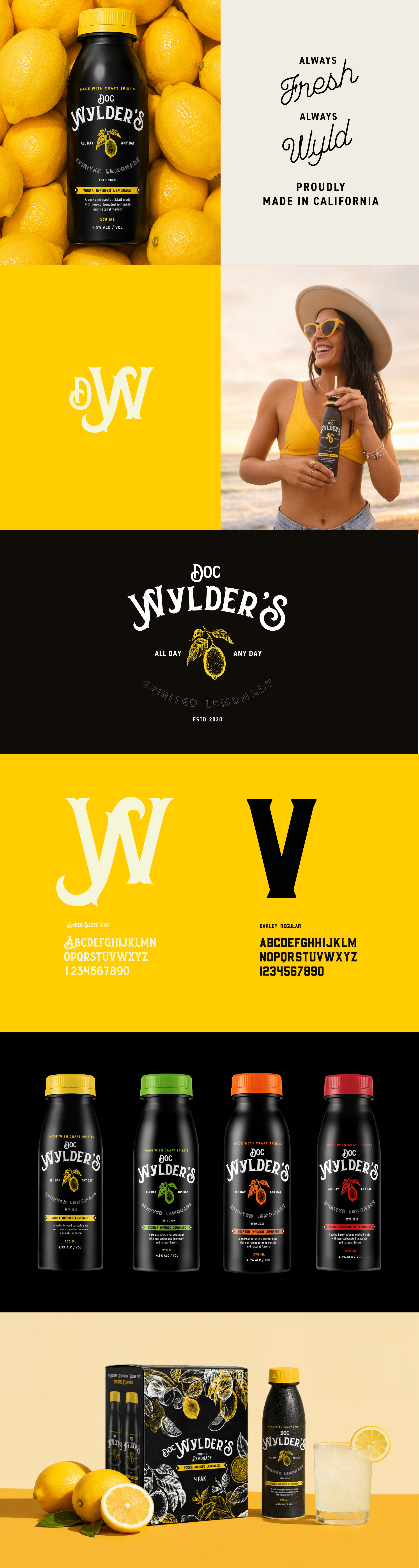
The design system I developed leans into Americana with a wyld streak. The logotype — set in Amber Taste Pro with Barley Regular as its counterpart — carries the swagger of old-world apothecary signage filtered through a sun-bleached, river-rat sensibility. The primary palette is bold and unapologetic: near-black and sunflower yellow, the kind of contrast that reads from a hundred feet away and still looks good on a bandana. I built the brand around a core tagline duality — Always Fresh, Always Wyld — and a rally cry that did exactly what good brand copy does: it made people feel like they already belonged. When Life Gives You Lemons, Just Chill.
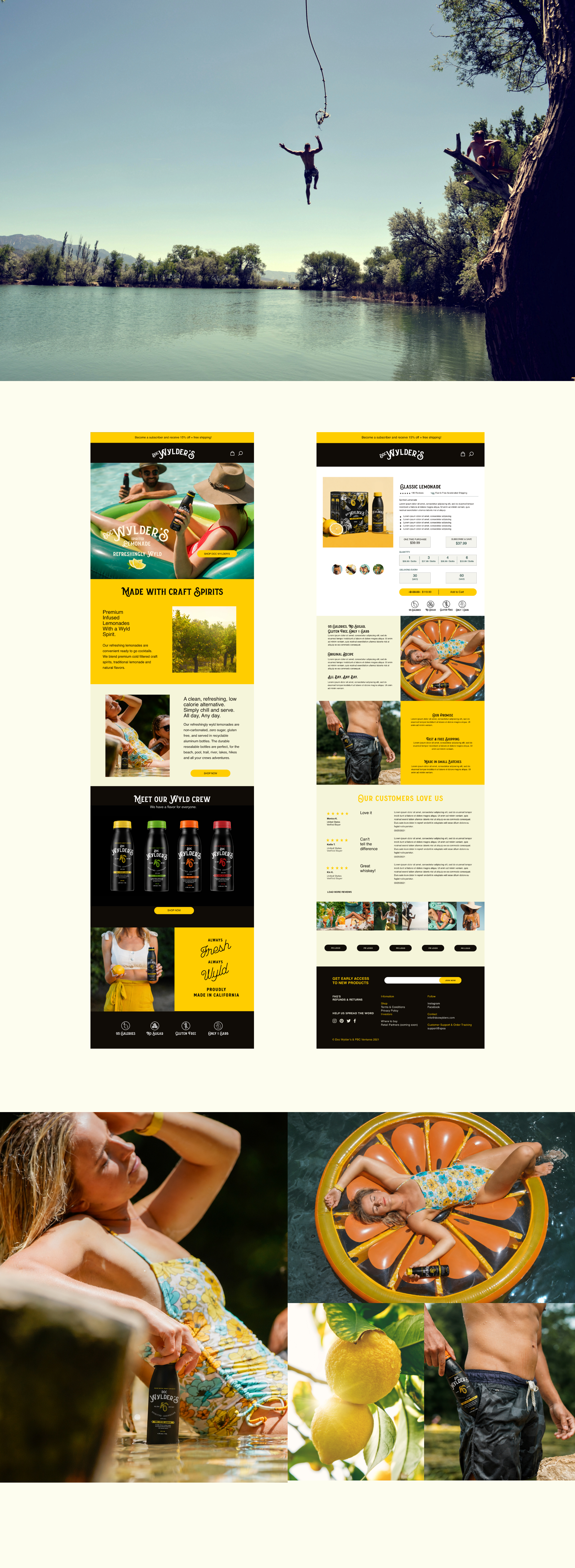
From there, the identity extended across every dimension of the brand. I directed the full packaging system — four SKUs differentiated by spirit base, each signaled through a distinct citrus colorway against the signature black bottle — along with a 4-pack retail carton design, a DTC website, and an experiential toolkit that included an Airstream activation trailer, branded cargo trike, golf cart bar, coolers, and a vintage Dodge A100 van wrap. The merchandise suite — tees, bandanas, and beyond — was built to function as wearable brand advertising, the kind of gear someone keeps because it actually looks good.
The result was a brand that felt fully inhabited: a complete world, not just a label. Doc Wylder's launched with the visual coherence and personality depth of a brand that had been around for years.