
Dermazen Case Study 4.png

Dermazen


PEACEFUL SKIN. PIECE OF MIND.

As co-founder and founding creative director of Dermazen, I helped build the brand from the ground up. I shaped its identity, visual language, packaging system, content direction, and digital marketing presence during its formative years. My role sat at the intersection of brand strategy, design, storytelling, product marketing, and creative production, helping translate a complex scalp-care and skin-health category into something approachable, modern, and emotionally resonant.

From the beginning, the challenge was to create a brand that could feel both science-backed and human. It needed to be credible enough to speak to clinical results, biofilm, flakes, redness, and scalp discomfort, while still feeling calm, natural, inclusive, and beautiful. I developed the visual foundation for the brand across logo, color, typography, packaging, photography direction, educational graphics, campaign concepts, and digital content systems.

As the brand grew, I continued to lead and execute a wide range of creative work across e-commerce, social, email, product launches, paid media, educational content, and visual storytelling. The work helped establish Dermazen as a distinctive voice in the scalp and skin-care space, rooted in clarity, calm, ingredient transparency, and visual proof.
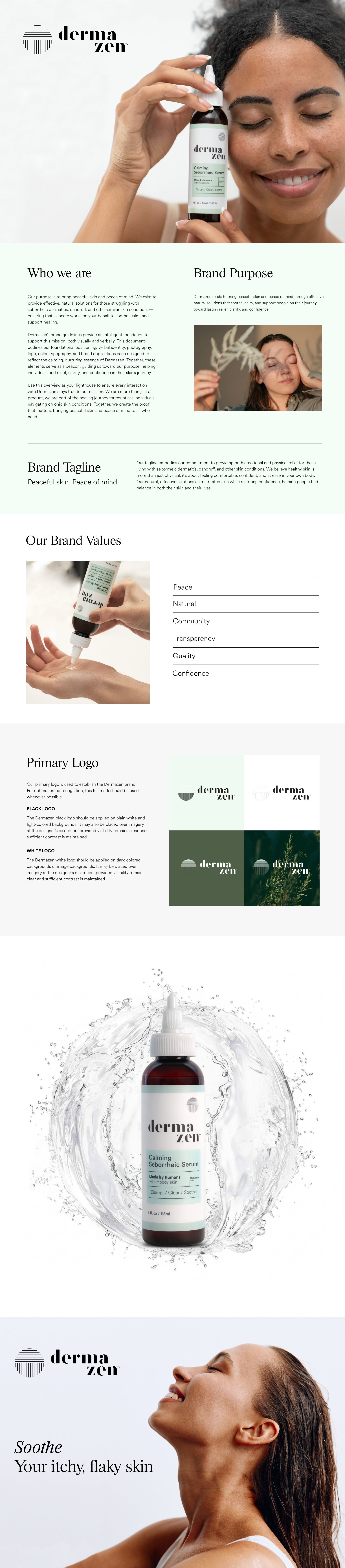
 

IDENDTITY & VISUAL LANGUAGE

I developed the foundational identity system for Dermazen, including the logo, color palette, typography direction, packaging language, and overall brand atmosphere. The goal was to create a visual world that felt calm, clinical, natural, and elevated, a departure from the overly medical or harsh visual language common in dandruff and scalp-care brands.

The packaging system was designed to feel clean, trustworthy, and modern while allowing each product to have a clear role within the broader routine. Soft greens, structured labels, botanical cues, and minimal layouts helped communicate relief, balance, and skin health without relying on fear-based or overly pharmaceutical design tropes.
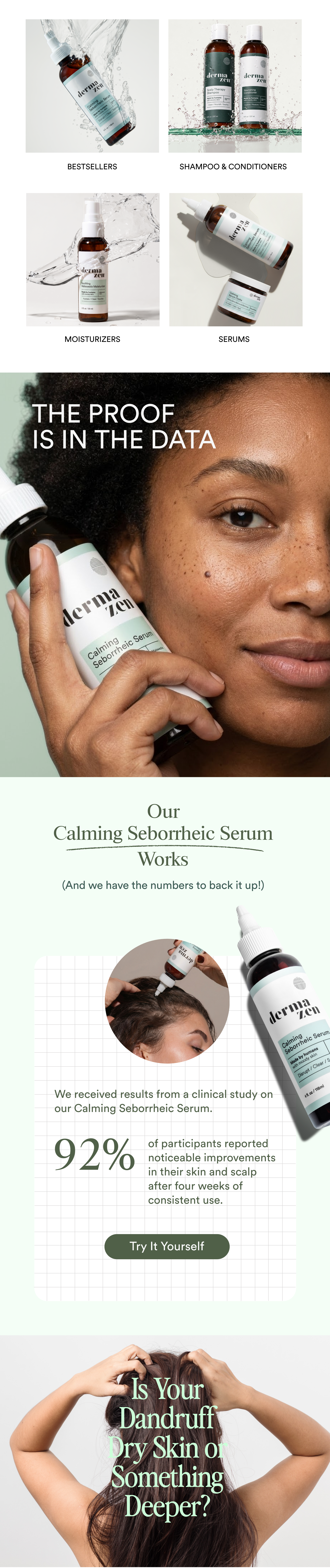
IDENTITY & PACKAGING

I developed the foundational identity system for Dermazen, including the logo, color palette, typography direction, packaging language, and overall brand atmosphere. The goal was to create a visual world that felt calm, clinical, natural, and elevated, a departure from the overly medical or harsh visual language common in dandruff and scalp-care brands.

The packaging system was designed to feel clean, trustworthy, and modern while allowing each product to have a clear role within the broader routine. Soft greens, structured labels, botanical cues, and minimal layouts helped communicate relief, balance, and skin health without relying on fear-based or overly pharmaceutical design tropes.

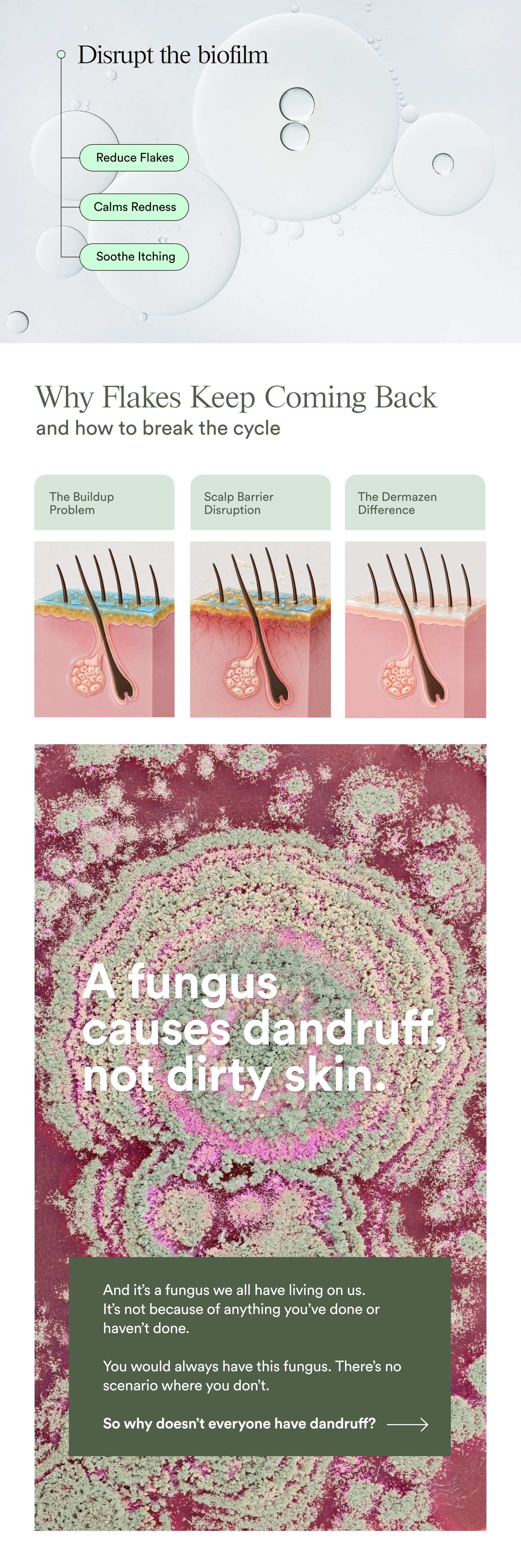
SCIENCE & VISUAL LANGUAGE

A major part of my role was translating Dermazen’s scientific positioning into simple, compelling visuals that customers could understand quickly. I helped develop the brand’s educational language around biofilm, Malassezia, buildup, flakes, scalp barrier disruption, and why symptoms often return.

This visual system included diagrams, clinical study graphics, product mechanism-of-action concepts, ingredient storytelling, and data-driven layouts. The objective was to make the science feel accessible and visually engaging through clean compositions, soft clinical cues, microscopic textures, serum bubbles, scalp diagrams, and proof-based messaging.

DIGITAL MARKETING & CONTENT

I created and directed a wide range of digital marketing assets across the Dermazen ecosystem, including website visuals, social media content, paid ads, email creative, product launch campaigns, educational graphics, lifestyle photography direction, and video concepts. The creative blended product benefit messaging with emotional lifestyle storytelling, helping the brand speak to both the discomfort of scalp issues and the relief of finding something that works.

Across social, email, and e-commerce, I helped establish a flexible content language that could move between science, product education, customer pain points, ingredient stories, and aspirational skin-health imagery. The result was a digital presence that felt ownable, calm, trustworthy, and visually consistent across multiple customer touchpoints.